

Color Grading – Achieving the Cinematic Look
Michael Light · August 21st, 2026 · Photoshop, Tutorial
What is Color Grading?
The most common comment I get about my photos is something like: “Your shots look like a scene from a movie or a game!” Usually followed by: “How do you get that look?” And the real question behind all of that is: “What does color grading actually mean – and how do you do it?”
Despite what the name suggests, color grading isn’t just about color. It’s about deliberately shaping the mood of an image through color, contrast, and brightness. Cool blues in the shadows, warm orange in the highlights, a bit more contrast in the midtones – and suddenly a photo feels like a still from a film. Which brings us to a good example: the teal and orange look, used in an almost absurd number of movies – Transformers, Iron Man, Mad Max: Fury Road, to name just a few.
Anyone who’s spent time in photo or video editing has probably come across the term “color grading” at some point. And just as many people have immediately been put off by it, because it genuinely is a science in its own right. If you really want to master it, you’ll eventually need to dig into the basics of color theory. Most of us remember the color wheel from school and have some idea what complementary colors are, or how warm and cool tones affect the mood of an image. But the moment I start talking about split-complementary schemes or tetradic harmonies, browser tabs start closing.
No worries though – I’m not a professional on the subject, and I’m not here to rattle off a bunch of googled expert knowledge. I just want to show you how I approached it myself. Starting with blind experimentation, and gradually moving toward more deliberate, technique-driven adjustments.
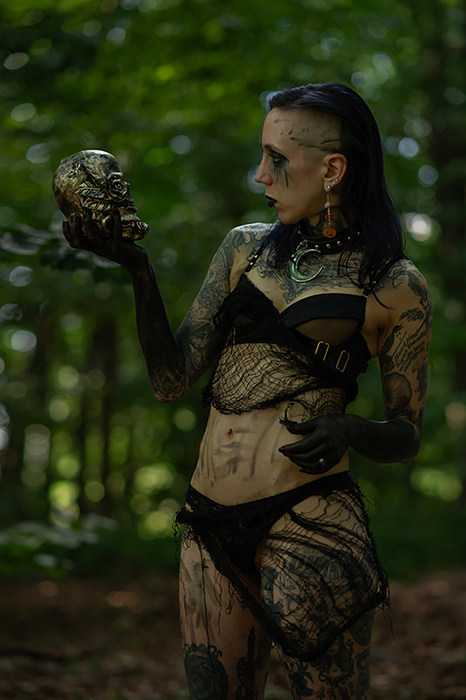
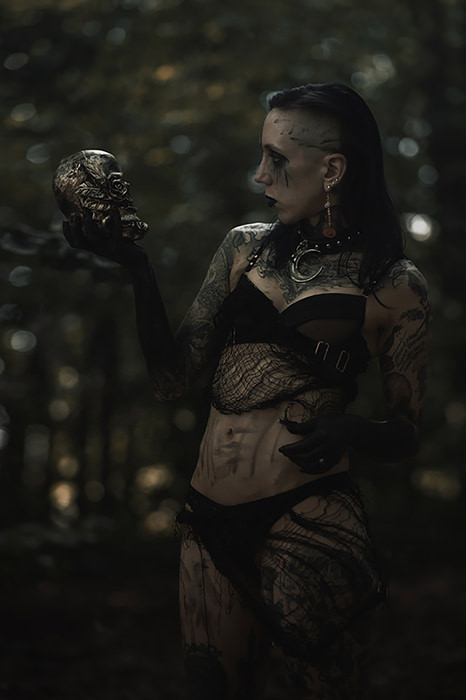
Selective Color
Technically speaking, Selective Color (Layer > New Adjustment Layer > Selective Color) is a correction tool – meant to fix specific color problems like a sky that’s too green or skin tones that are too yellow. It’s basically the kind of thing you’d use before color grading, to get a neutral starting point. But for me, it was also the first tool I used to just mess around with color. And it’s a great place to start, because you get immediate, visible feedback from just dragging sliders around.
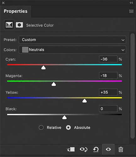
The idea is simple: you pick a color range – reds, greens, blues – and adjust the cyan, magenta, yellow, and black within that range. Where it gets interesting for our purposes is in the Neutrals, combined with the Absolute method.
Try setting the Cyan slider in the Neutrals to +30 and the Yellow slider to -20, and see what happens. Your image will suddenly have a direction to it – even if you’re not quite sure why yet. The reason is that neutrals, by definition, contain equal amounts of all color channels. Shift them, and you’re tinting the entire midtone range of the image without directly touching any specific colors. The result feels atmospheric rather than local.
For precise, repeatable color grading there are better tools – but as a playground for understanding how colors interact, Selective Color is a great starting point.
The Classic Cinematic Look: Teal & Orange
Deep blue-green shadows, warm orange skin tones – if you think back to the movie examples from the intro, you know exactly what this looks like. Teal and orange is probably the most well-known color scheme in cinema. Fun fact: strictly speaking, it’s not actually a true complementary pair – the exact complement of teal would be closer to red than orange. A beloved debate among color theorists, apparently not so much in Hollywood.
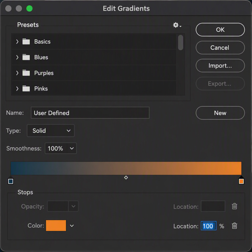
The reason this look is used so often is that it creates a striking result with a surprisingly harmonious feel. It also works across a wide range of subjects – landscapes, architecture, portraits. And like most things in Photoshop, there are several ways to get there. One of them is the Gradient Map (Layer > New Adjustment Layer > Gradient Map).
Here’s the step-by-step:
- New adjustment layer: Gradient Map
- Click on the gradient – the Gradient Editor opens
- Left color stop (shadows): a dark teal, e.g.
#1a3a4a - Right color stop (highlights): a warm orange, e.g.
#e8832a - Layer blend mode: Soft Light or Color
- Opacity: somewhere between 30–60%, to taste
The Gradient Map maps your shadows to the left color and your highlights to the right. You can also add more color stops – just click anywhere along the gradient bar in the editor – to tint the midtones or build more complex looks.
Small spoiler: at the end of this article there’s a creative tip for a very different use of the Gradient Map.
Color Grading in Camera Raw
The Gradient Map is fast and intuitive – but if you want more control over the color temperature in your highlights and shadows without having to define a gradient yourself, the Color Grading panel in Camera Raw (Filter > Camera Raw Filter) is worth a look.
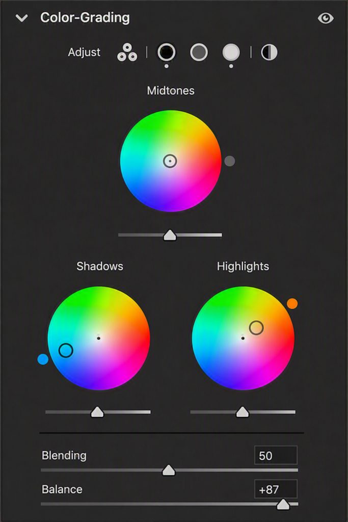
This used to be called “Split Toning” and worked with simple sliders for hue and saturation – since Camera Raw 13.1, it’s been replaced by three color wheels for shadows, midtones, and highlights. A genuine upgrade.
The difference from the Gradient Map: Camera Raw works with color wheels, which feels more intuitive – you just drag in the direction you want. On top of that, everything you do in Camera Raw can be saved as a Smart Filter, meaning it’s fully non-destructive – the original pixels stay untouched and the settings can be adjusted or undone at any time. Just convert your layer to a Smart Object first. One downside: Smart Objects embed the original data, which can significantly increase file size – especially with RAW files.
Ready-Made Looks in Seconds: LUTs
LUT stands for Look Up Table – essentially a color recipe that maps every color value in your image to a new one. Instead of building a look yourself, you apply a pre-made table and the image is transformed accordingly. If you know Lightroom, think presets – the idea is similar.
In Photoshop, you can access LUTs via Layer > New Adjustment Layer > Color Lookup, where you’ll find a range of built-in options – film emulations, technical looks, creative grades. On top of that, there are countless free and paid LUTs in .cube format available online, which you can import via the “Load” option.
But what’s actually creative about applying a pre-made look that someone else built? Fair question. Anyone who’s clicked through a few LUTs will quickly notice that the result rarely fits straight out of the box – sometimes the direction is right but the shadows get too bright. Sometimes the look warms the skin tones beautifully while simultaneously dragging the darks into a muddy dark green. Too bad. Or actually – not at all, because that’s exactly what blend mode and opacity are for.
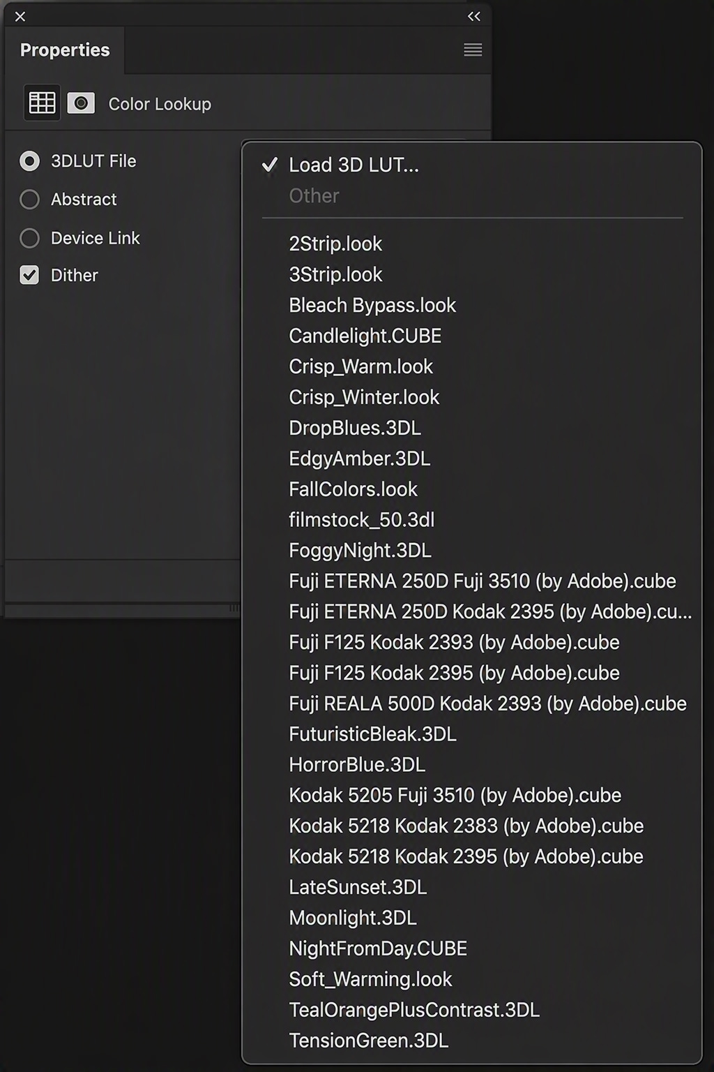
This is where the creativity comes in. Try setting a Color Lookup layer to the Color blend mode – that way, only the colors are affected, not the brightness or contrast. What each blend mode does exactly could fill its own article – for now, just experiment and see how the effect shifts with each one.
At the same time, I’d strongly recommend playing with the layer opacity. Most LUTs at 100% are far too aggressive – they tend to work much better when applied subtly.
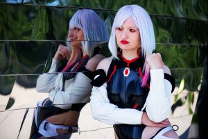
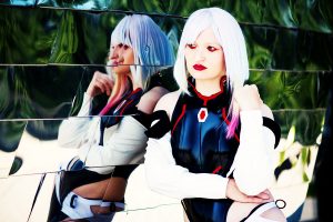
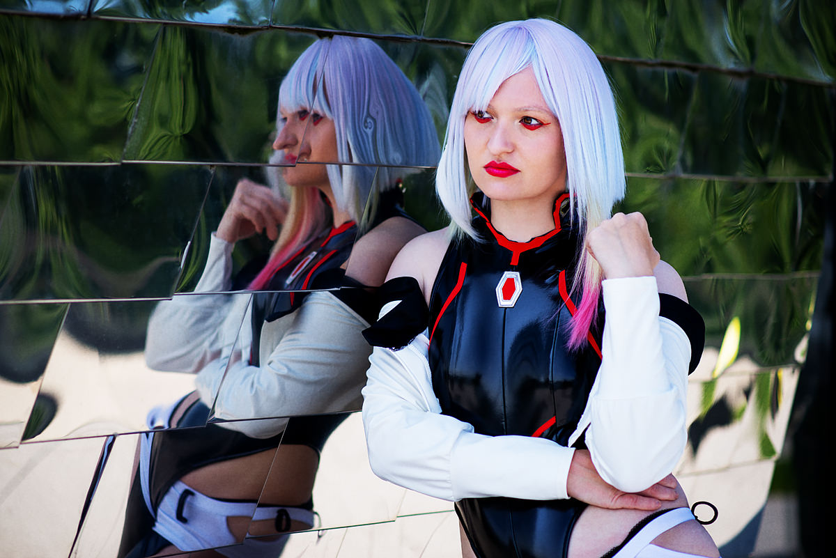
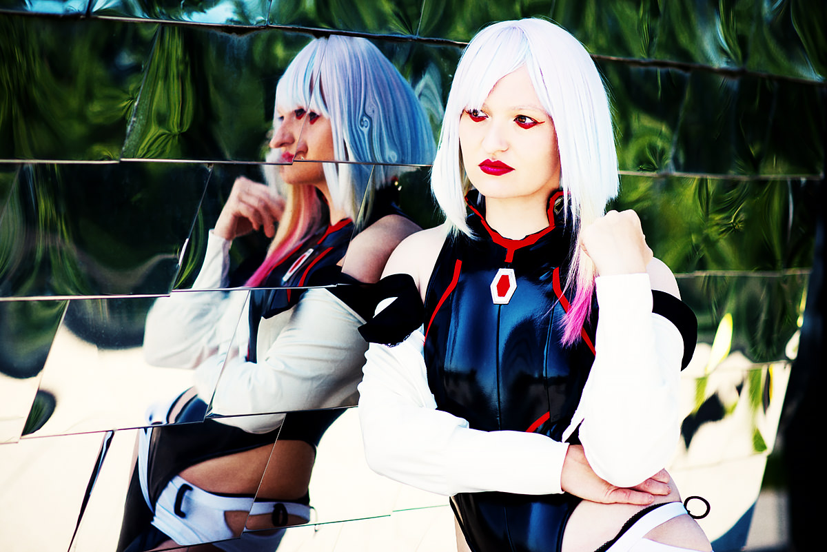
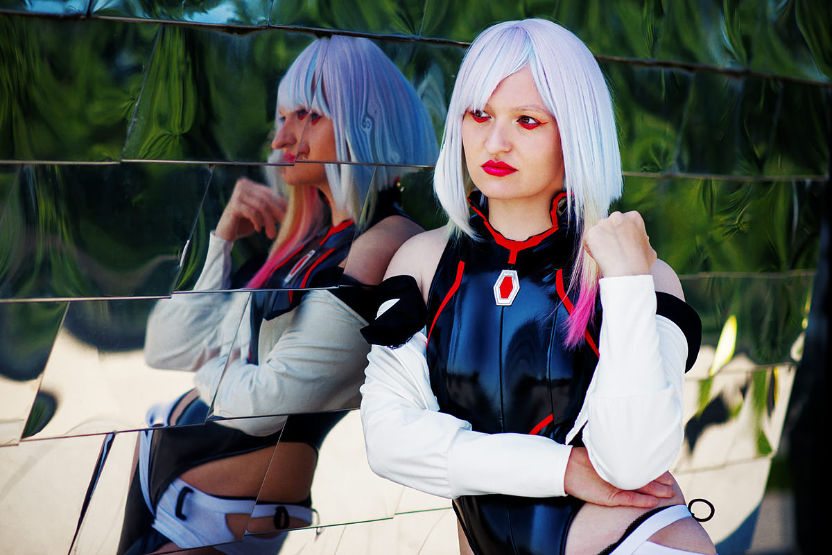
And that’s not all. Just because we’ve been using film references doesn’t mean “there can be only one.” When I build a grade from LUTs, I’ll often stack five or six LUT layers on top of each other – usually at 10–30% opacity, in different blend modes. The reason it doesn’t turn into a muddy mess comes down to one more important tool: a way to stop a LUT from affecting the entire image.
Luminosity Masks & Blend If: Color Grading Only Where You Want It
This is one of those things that was an absolute game changer for me. Applying effects only to a specific brightness range. Sticking with our teal/orange example – it can easily happen that the teal in the shadows looks perfect, but the skin starts looking more like a carrot. We want the look to affect only the shadows. Photoshop has two common ways to do that.
Luminosity Masks
The concept behind luminosity masks actually goes back to analog photography: Ansel Adams (yes, I genuinely had to google that name) divided images into 11 brightness zones – from pure black to pure white – to make targeted adjustments in specific tonal ranges. In Photoshop, the same principle works digitally.
You’ll find various Photoshop actions online that generate these zones as channels, which you can then use as masks. This lets you select, say, only the shadow channel and use it as a mask. Worth remembering that masks can also be inverted, or you can adjust their density – which is essentially the same as changing layer opacity.
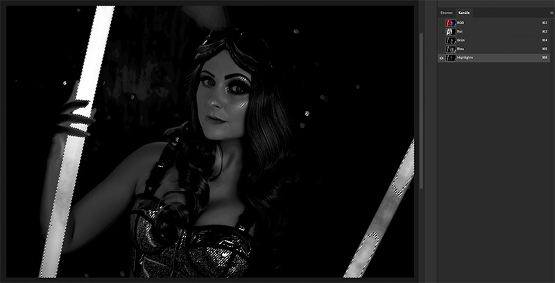
Working with luminosity masks is extremely precise and opens up a lot of possibilities. The downside is that it’s also relatively involved, even if you have a script or panel that handles the zone creation for you. And since a mask is a pixel layer, it comes with a real file size cost.
Blend If – The Lean Alternative
Tucked away in the Layer Style dialog – double-click on the layer (not the name) – you’ll find the Blend If settings. They’re a fast, lightweight alternative to luminosity masks, and in many cases more than enough for color grading.
Blend If is easiest to understand with a quick example. Create a Solid Color fill layer (Layer > New Fill Layer > Solid Color) and pick a saturated teal. Leave the blend mode on Normal for now – it makes the effect much easier to see. Open the Layer Style dialog for that layer (double-click the layer, not the name) and scroll all the way down to Blend If. The lower slider – “Underlying Layer” – is the key one: drag the black arrow from left to right and you’ll see the teal disappear from the dark areas of the image – the shadows show through. Drag the white arrow from right to left instead, and the color fades from the highlights. That’s how you control which brightness range an effect applies to – without creating a single mask. Now try switching the blend mode of the fill layer to Color, and you’ll see what the actual effect looks like.
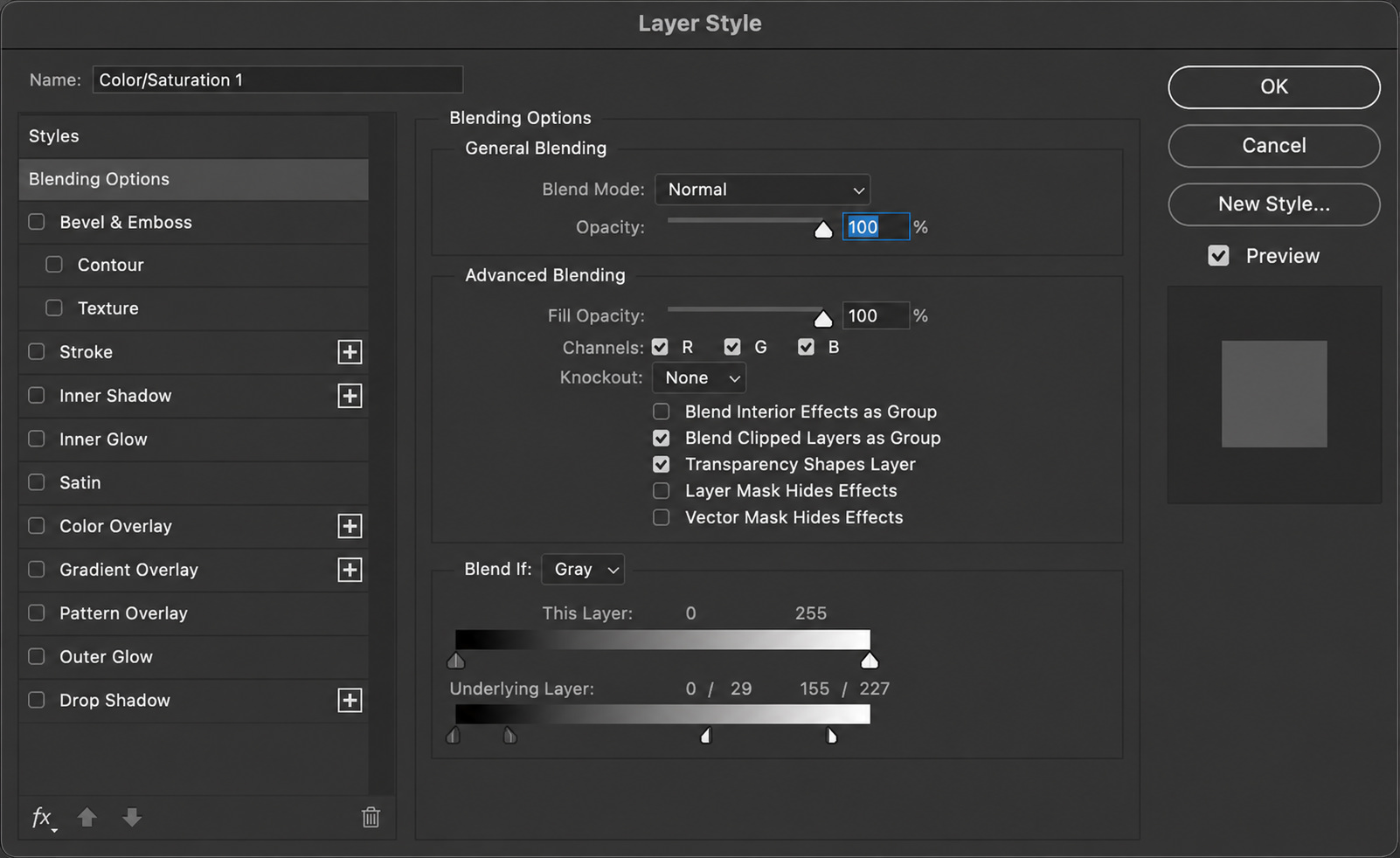
One important trick: hold Alt and click on either arrow, and it splits into two halves. This creates a smooth, gradual transition instead of a hard edge – without that split, you’ll rarely get a clean result.
Blend If is quick to apply, non-destructive, and extremely light on file size since no pixel layer is created for the mask. The trade-off is precision – on complex images with very varied brightness values, it can sometimes fall short.
Curves – Photoshop’s Chuck Norris
Beginners tend to avoid Curves because they look a lot more complicated than they actually are. Professionals, on the other hand, swear by them – and for good reason. Curves are one of the most powerful precision tools in Photoshop. You can use them to adjust overall brightness, boost contrast in specific tonal ranges, or shift the color balance. There’s honestly enough material here for an entire article – but for now, let’s just scratch the surface.
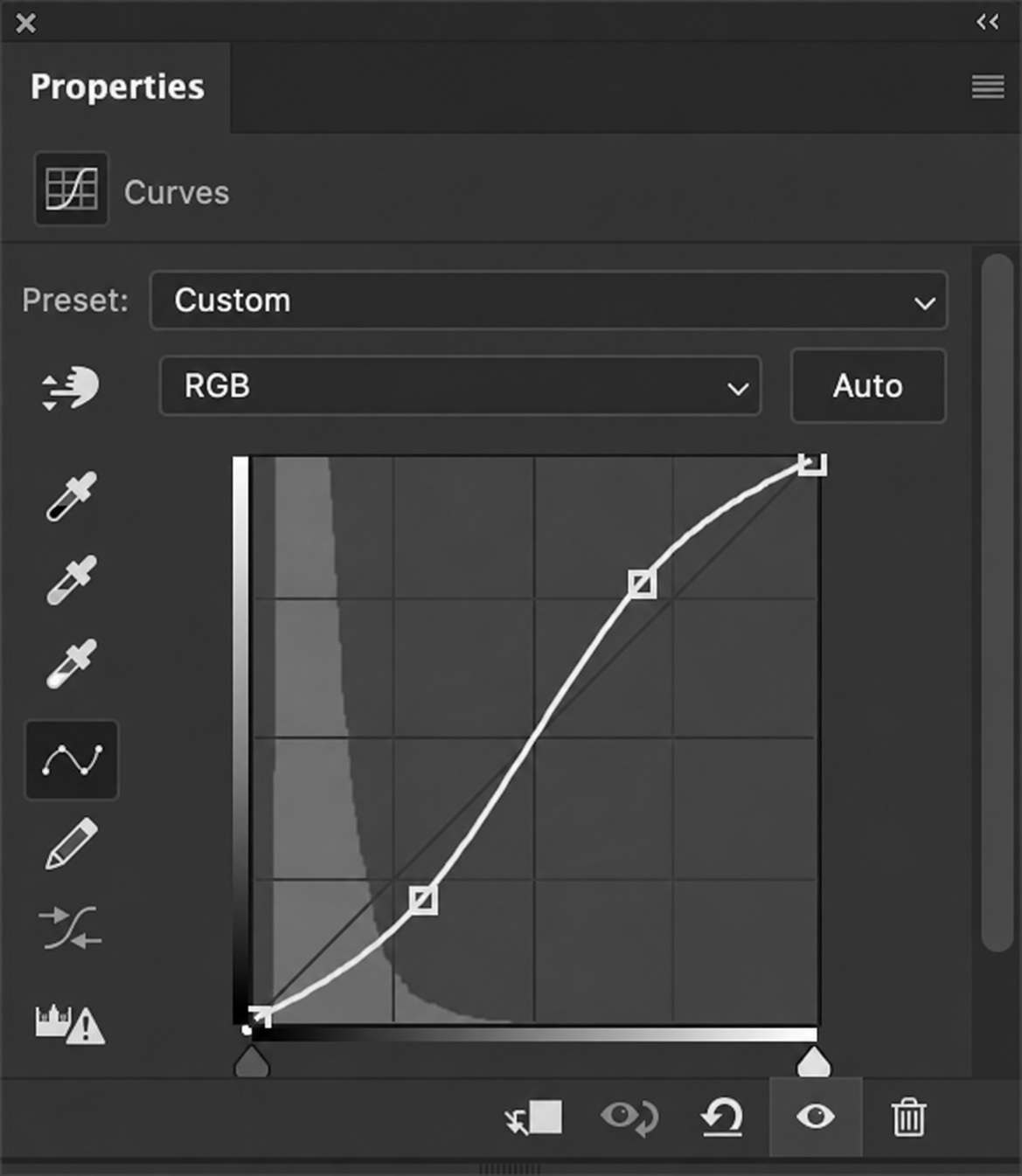
A Curves adjustment is essentially a translation table: it defines how each tonal value in the original image should look in the output – black is at the bottom left, white at the top right. The dropdown at the top of the dialog defaults to the RGB channel, which controls brightness and contrast across the entire image. Switch it to an individual channel – Red, Green, or Blue – and you can start pushing color into specific tonal ranges.
With our teal/orange example in mind, let’s create a new Curves adjustment layer (Layer > New Adjustment Layer > Curves). Switch to the Blue channel and drag the left anchor point – the shadows – slightly upward. The shadows go bluer. For teal, we also need some green – switch to the Green channel and nudge the left anchor point up just a little. The blue shifts into teal.
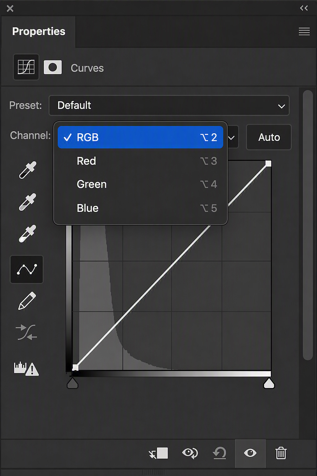
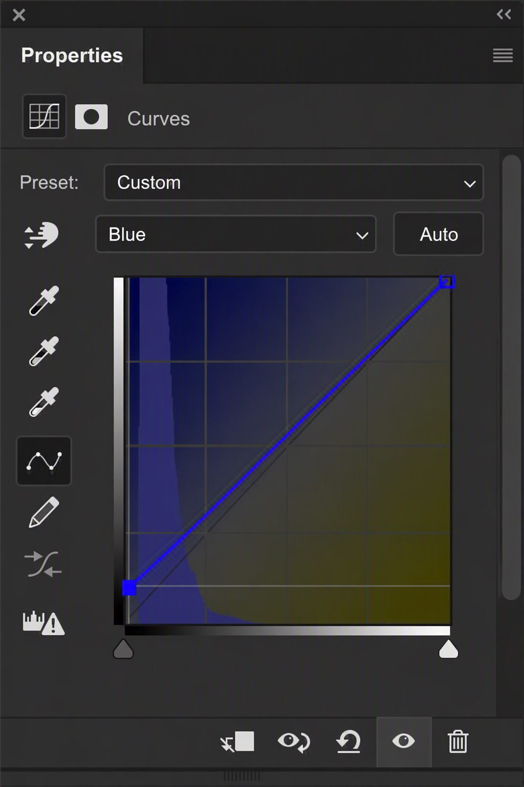
Now switch to the Red channel and drag the right anchor point – the highlights – slightly upward. The highlights get warmer and more reddish. For actual orange, we also need yellow – and in RGB, yellow is a mix of red and green. A small nudge upward on the Green channel in the highlights, and the warm tones shift toward orange. Welcome to the world of additive color mixing – where colors of light combine to create new ones.
You may have noticed while moving anchor points that Photoshop automatically creates a smooth transition to the next point. That means tonal values don’t get cut off abruptly – they flow into each other. One of the most useful curves that takes full advantage of this is the S-curve. It boosts contrast in the midtones without affecting the black or white points.
To add that contrast, we could create a new Curves layer – or just use the one we already have. Switch back to the RGB channel, place a point in the upper third and drag it slightly up, then one in the lower third and drag it slightly down. Done. Color and contrast, one single adjustment layer.
Curves might not be the most intuitive tool – but taking the time to understand them gives you a genuinely deep understanding of how color and tone actually work.
Creative Bonus: The Random Look
We started with experimenting – and that’s exactly how we’re going to finish. This one isn’t for precise, targeted work, but it’s a fantastic way to stumble across a look you’d never have come up with on your own.
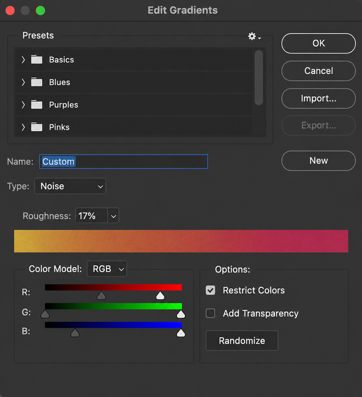
Create a new Gradient Map and immediately set the layer blend mode to Soft Light – it gives the most natural result and makes it easier to judge what’s actually working. Then click on the gradient and change the Gradient Type to Noise.
A seemingly random, colorful gradient appears. Two settings are worth adjusting here: set Roughness to 0% so the gradient stays sharp and high-contrast. And use the RGB sliders to restrict the range of each color channel – this keeps things from getting too wild and lets you nudge the randomness in a specific direction.
Then just keep hitting Randomize. Photoshop generates a new gradient every time, and with it, a new look. Sometimes too colorful, sometimes too green, sometimes exactly what you were looking for.
This is actually my first genuinely technical article on the blog – I hope it gives someone a useful starting point. Comments, questions, and feedback are always welcome. But what I’d love most is to see your first results when you try these techniques out. Share your grades with me on social media!